What Makes a Great Logo Design?
November 29, 2018
Jeremy Wells
Your Logo Isn’t Your Brand
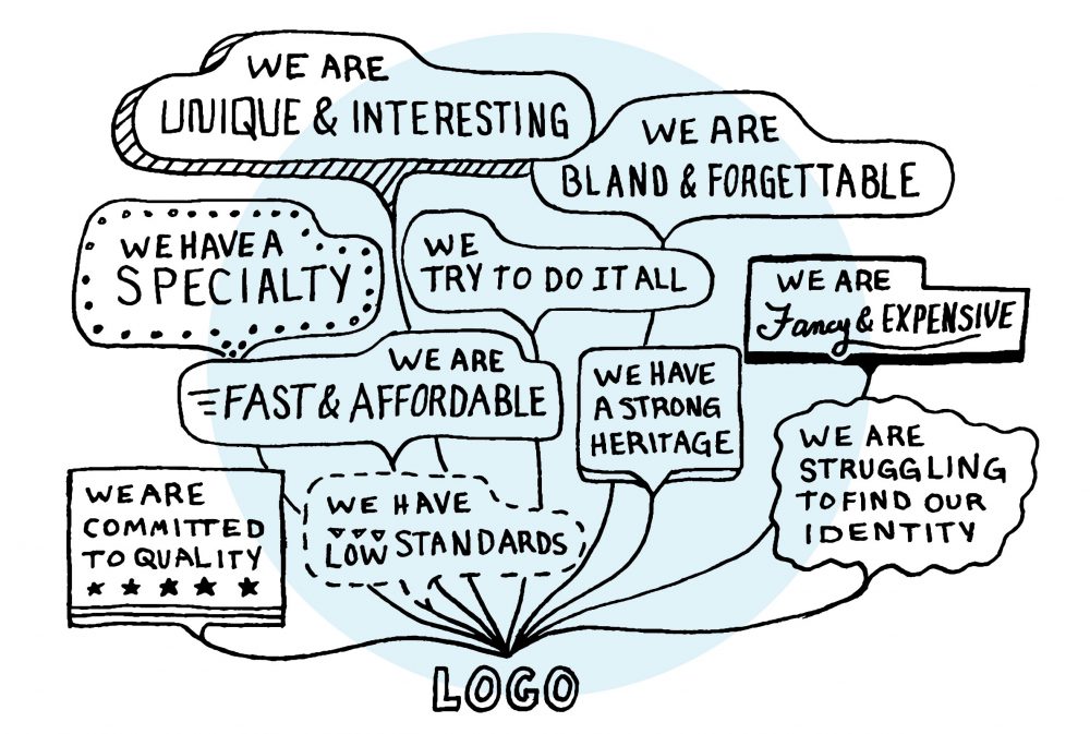
Although the words “logo” and “brand” are often mistaken to be synonymous, your logo isn’t your brand. A logo is certainly a vital piece to building a great brand, however, your brand is really your reputation. Your reputation is created by what you do, what you say, and how you look. Often the first interaction a customer will have with your brand is your logo. Your logo creates the first impression, and you don’t get a second chance at a first impression.
Most people understand the importance of a logo for a company, there’s no debating that. However, what really makes a great logo?
Making a Great Logo
Have you ever wondered if you’re missing new business opportunities based on the quality of your logo design? You can be if your logo doesn’t resonate with your audience or if it does not capture your brand’s essence. The overall marketing significance of your logo design for your brand plays a major role in your brand’s perception in the market. If the links between your logo, brand, and potential customers are not fluid, you have a valid reason to consider redesigning the logo.
The development of a logo may depend on the type of logo you are looking for, have or want to fine – tune. Below you have some factors to consider when deciding whether it is time to design, redesign or modify the logo of your company. We will use actual examples of major brands and highlight things you might not have known about.
The Concept
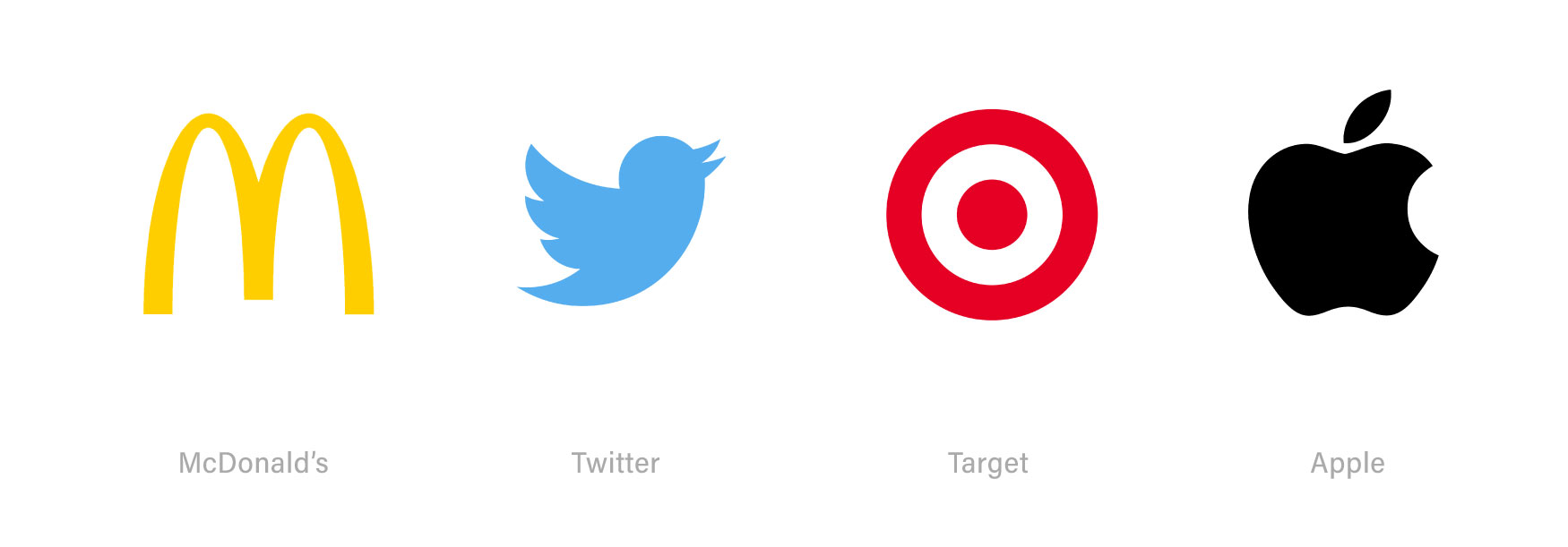
The concept and underlying idea of the logo are extremely important and valuable as well. The way a logo designer incorporates a company’s name to a logo can be simply brilliant. When done right, it looks easy and the instant you look at it makes sense. Often you can simply look at a great logo and say “ It’s so simple, how did I not think of that?! ” What makes the following designs so great is their simplicity, and how the symbols clearly represent the name of the company.
Unique Factor
The original design of the logo is an obvious factor in the perceived value of the logo. Originality can be found in many ways, but it certainly helps your logo to stand out amongst your competitors and other companies. When thinking about some of the most iconic logos, you can see how they are all very original.
Legibility
For 99% of logo designs, legibility is so crucial. The name of the company needs to be read easily and quickly so that customers can understand who the company is and how meaningful it is to them. For the majority of companies, the selected typeface used in a logo should reinforce the personality of the brand.
Although readability is such an important component in a logo design, there are some well-known brands whose logos are difficult to read. For instance, the Mossimo logo has been around for nearly 30 years, and it is unique and still widely-recognized in the retail and clothing sector even with letters that are not completely legible.

Using Lettermarks
One of our favorite logo design variants consists of a unique set of letters or original letterforms that create the logo. For instance, Disney, H&M, and Coca-Cola are all hand-drawn letterforms which make these logos very distinctive. For such logos, special attention must be paid to keeping the individual letters consistent in some manner, such as maintaining a similar x-height, angle, baseline, or stroke weight. If variables exist in these things, the design of the logo usually starts to be less coherent.

Simply Iconography
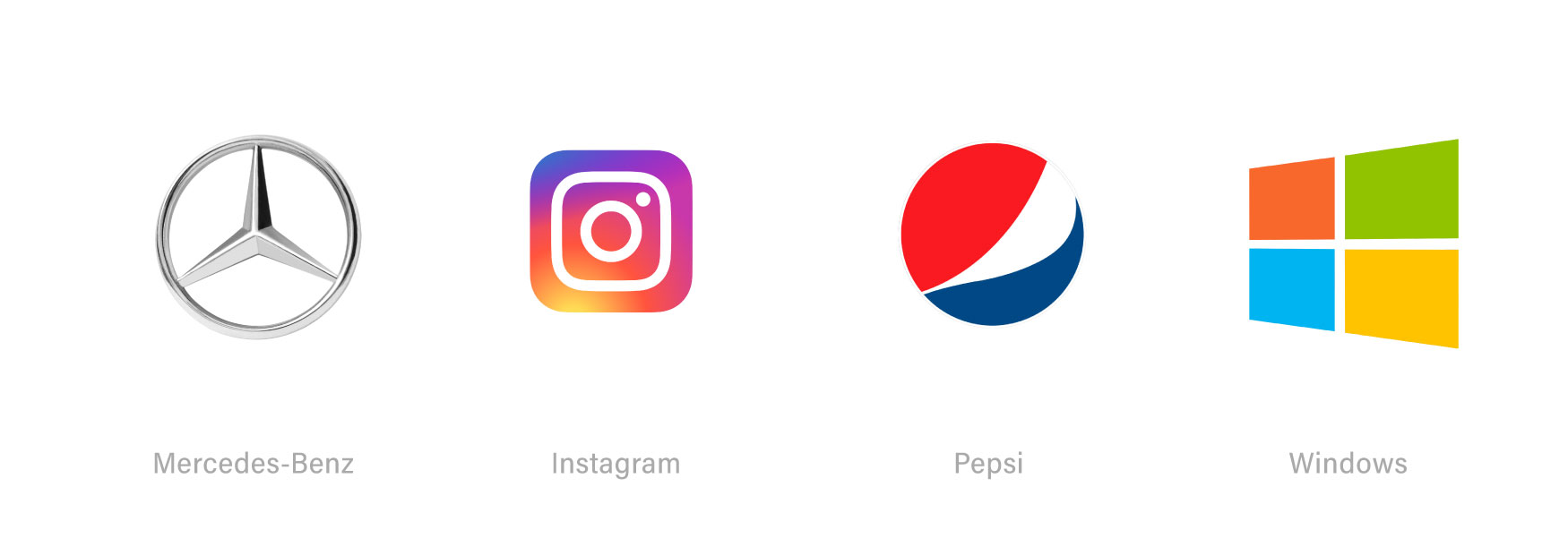
Many logos have a word mark, letters describing the company name and an icon. The logo icon is a symbol which can be used with the word-mark or without it. for these big name brands, the icon may be the only thing needed to recognize the brand. A recent customer who came to us to design his logo wanted a small, simple ” checkmark ” icon that can be used without a wordmark. The following examples show popular brands using iconography for their design of the logo.
Attention to Detail
Of the world’s top brands, nine out of ten logos are easy enough to be seen in small sizes. But why do we see some brands that own logos with a substantial amount of detail which often present challenges at small sizes or when reproduced in certain ways?
Attention should be paid to detail, which can be very important for luxury brands. Extreme detailing in some logos can be lost at smaller sizes, and are often difficult to reproduce in silk screening or embroidery. However, the richness of a detailed logo often strengthens its luxurious appeal when done well. See all the details in the following logos about a story and its heritage.


Connect with Longitude°
Searching for a hospitality branding agency to partner with on your next project? Fill out the form below and let’s talk. Or you can email info@longitudebranding.com
Jeremy Wells
Partner at Longitude°
Jeremy is the author of Future Hospitality and Brand Strategist at Longitude°. As a member of the Education Committee for The Boutique & Lifestyle Leaders Association (BLLA) and a content contributor to Cornell University’s Hospitality Vision and Concept Design graduate program, he is a committed thought leader in hotel branding, concepting, and experience strategy.
