What Is Your Logo Telling People?
August 19, 2016
Dustin Myers
Post Written for Foodabletv.com
Your logo is likely the first part of your brand that people will see. It is the key element of your brand identity. It sets the tone for communicating who you are and what a customer can expect. So, what is it telling people about your restaurant?
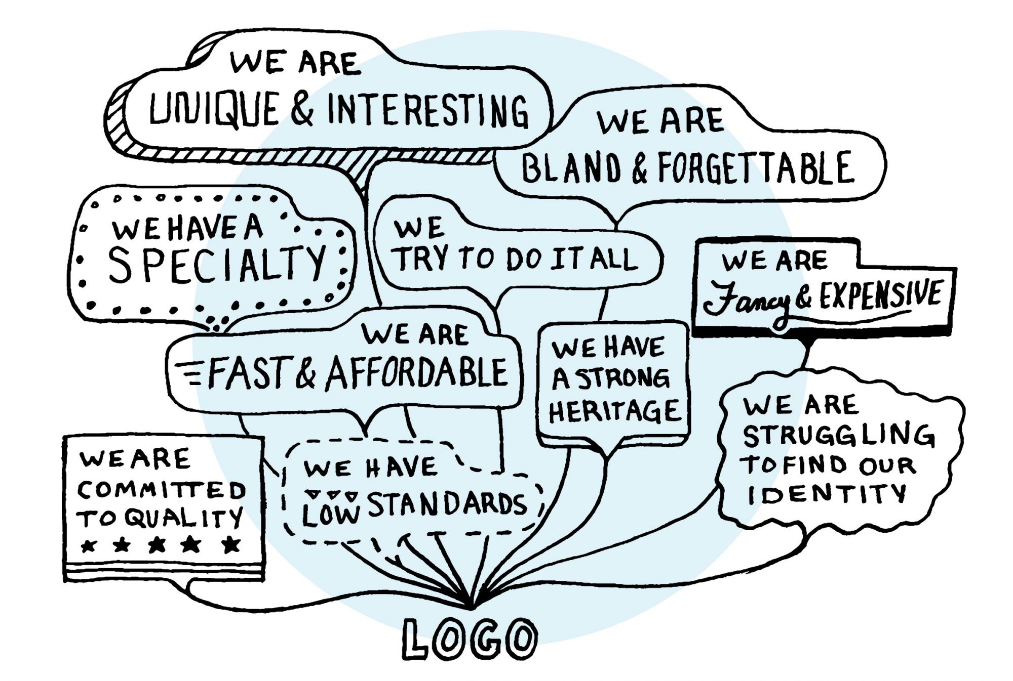
Statements your logo could be making:
- We are unique and interesting.
- We are bland and forgettable.
- We specialize in one area.
- We focus on multiple areas
- We are fancy and expensive.
- We are fast and affordable.
- We have a strong heritage.
- We are struggling to find our identity.
- We are committed to quality.
- We have low standards.
“Design is the silent ambassador of your brand.”
— Paul Rand, Designer of iconic logos, included IBM, UPS, and ABC
3 Areas Where Your Logo Speaks
1. Story
Does your brand story come through in the design? Does your logo have meaning? What is it that makes you unique? Does the logo effectively communicate that? Is it intriguing to someone passing by?
A good logo should quickly tell a customer what type of experience they can expect. If you are a fast-casual concept that values high-quality ingredients, would someone pick up on that by seeing just the logo?
The Swap Test
Want to see just how effective your logo is (or isn’t)? Here’s a simple test. Swap part of your icon — the name or the visual element — with that of a competing brand, or even a brand from another category. If the resulting icon is better, or no worse than it was, your existing icon has room for improvement. By the same token, no other company should be able to improve its icon by using part of yours.
“A good brand icon is like a tailored suit — it should only look good on you.”
Marty Neumeier, The Brand Gap
2. Color & Type
Selecting colors for your logo is more than a stylistic decision. Color can set the feeling or the mood for your brand’s personality. It is interesting to look at the psychology behind how colors generally make you feel. These are not concrete rules because many people factor in their own personal associations. Don’t rely completely on this concept, but it’s good to know the rules so you know how to break them. When you combine multiple colors and design elements you can begin to paint a very clear picture.
Using a lot of colors will feel playful, exciting, younger, and happier. Using fewer colors will feel more mature and sophisticated. Using only black and white will feel luxurious and expensive.

Dustin Myers
Partner, Longitude°
Dustin started the company that would become Longitude°. With a deep focus in creating the methodology and processes that would become known as BrandGPS™. He is always striving to find ways to bring value to those around him and passionately focused on helping solve extremely complex brand challenges.
