Rebranding Longitude°
October 5, 2017
Dustin Myers
Longitude° has evolved a lot over the past few years. With change comes the question of whether your identity is reflecting the brand correctly. Just as a person dresses and acts in a way that reflects their values and motivations, an authentic company should make sure that the inner workings and outer appearance align.
The strategic shift
In the past year, the focus of Longitude° has changed from just brand identity design to a strategy-first approach. In working with clients, I have seen the tremendous value of the brand strategy workshops. Moving forward, Longitude° will put a much greater focus on brand strategy.
Helping companies understand who they are, who their audience is and how to communicate properly is a necessary and vital step in a successful design process.
What does this look like practically? Before the pencil hits the sketchbook there is a strategic process that clients must go through. This is usually accomplished through strategy workshops. Together, we walk through exercises and worksheets to define aspects of the brand. Desired perceptions, brand values, ideal customer, positioning statement, pillars of positioning, value proposition and validation research.
Over the past year, clients have been experiencing the results of this process and it has added so much value for their organizations.
The design solution
Design is a tool. It is not decoration or a necessary evil. It is properly using visual aids to evoke emotions, communicate values and reflect your strategy.
The previous logo and identity no longer communicated the proper message and position. I knew that a change was coming and have been working towards this for a while.
The name Longitude° was born out of the desire to help brands understand where they are, where they want to get, and partner with them along that journey. This mission has not changed; it’s only become more clear. For this reason, the name Longitude° will remain.
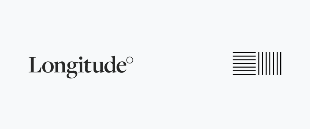
The new wordmark is set in a serif font that looks more like a mature strategic consultancy. It is intended to communicate a higher level of detail and purpose. The new mark is set in dark gray instead of blue. This color should look more sophisticated and more versatile when presented alongside other brands.
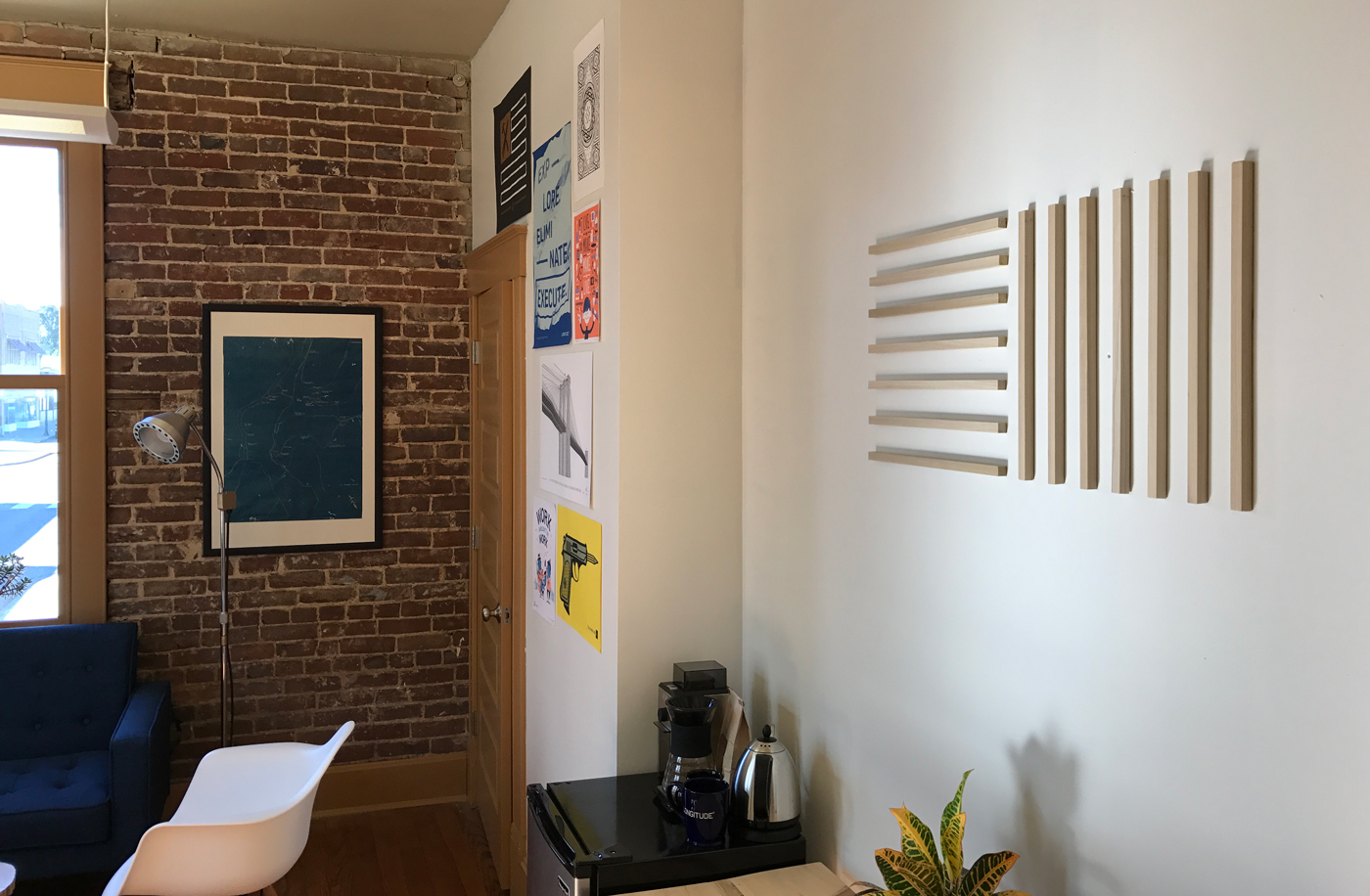
The new brand mark is a simple set of lines based on the lines of latitude and longitude. The goal is to be simple, refined and meaningful.
In the past eight years, Longitude° has been privileged to work with brands all over the world. I’m excited to continue growing alongside you and making the world a more enjoyable place.
Dustin Myers
Dustin Myers
Partner, Longitude°
Dustin started the company that would become Longitude°. With a deep focus in creating the methodology and processes that would become known as BrandGPS™. He is always striving to find ways to bring value to those around him and passionately focused on helping solve extremely complex brand challenges.
